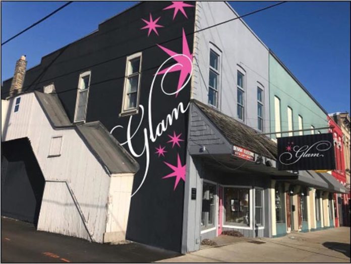
There are only a few noteworthy eyesores in downtown Warsaw, and one of the biggest might soon get a makeover.
The owner of Glam, a women’s boutique at 212 S. Buffalo St., as well as the building’s owner, Mike Dennie, are seeking to paint the south side of the large, two-story exterior wall.
The upgrade seems consistent, said Michelle Ledrew, owner of Glam, since much of the downtown has seen various upgrades, including a $100,000 alley enhancement one block to the north and the emerging popularity of outdoor seating in front of several restaurants.
The 200 block of South Buffalo has seen vast upgrades over the years with storefront improvements involving Giverny Fitness Studio, Expressions Salon and Day Spa, The Repurpose Room, Jerky Shop and Kosciusko County Community Foundation headquarters.
“We don’t want to be the eyesore on the corner,” Ledrew said. “We’ve had a lot of success here and we don’t think that translates.”
Given the size of the wall and the fact it faces northbound motorists coming off Ind. 15, it also represents an image issue for the city.
“There’s so much traffic that comes from that direction, it’s really the first thing they see when they come downtown,” Ledrew said.
With no money available in the city’s alley enhancement fund, officials began eyeing money in a facade program controlled by Warsaw Community Development Corp. There is $10,000 remaining in this year’s facade budget, but the Glam proposal doesn’t conform to the facade guidelines since the side wall is not part of the facade.
As a result, Rob Parker, executive director of Kosciusko Chamber of Commerce who oversees Warsaw Community Development Corp., is working with the city council to see if money from the facade program can be used for the wall.
Council is expected to discuss the issue when it meets Monday night.
The facade program can provide up to $5,000 per proposal, Parker said.
Parker also mentioned the wall’s appearance.
“It just doesn’t look as good as it should,” he said.
An old, somewhat rickety stairwell that had been enclosed has been removed from the wall, which also includes several boarded up windows. Gold metal stars affixed to the wall are showing their age and a rusty residue has stained part of the wall below.
Ledrew had an artist’s rendering prepared to illustrate what the wall might eventually look like.
The proposed color scheme would be consistent with Glam’s other signage, using a black background with pink stars and white lettering for the business name. Ledrew said the use of the stylistic font for the name probably depends on the overall cost.


